Thursday 15 October 2009

Photoshopping face


In our media lesson we were asked to photoshop this girl's face.
Original: left
Photoshopped: right
I have used auto levels because the computer alters the white and black balance of the image. This is the computer's judgement and not mine. This will probably be more accurate.


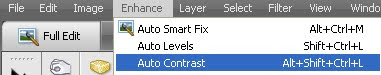
I also used auto contrast for a similar reason. Auto contrast changes the shadows and highlights in an image. This is the computer's judgement and is probably more accurate than mine.


I also manually adjusted the shadows and highlights. This allows me to change the highlights rather than the computer. I made the shadows really dark so that it made the image a lot darker and bolder. I then increased the midtone contrast. This increases the sharpness manually, and makes the image more bolder.


As usual i added 3 photo filters. First i added a yellowy green colour to give the photo a natural lookl. I then added an orangey colour to make the model look a skin shade darker, and finally i added a black filter just to drain some of the colour out to make the photo look like it's been taken using a professional camera.


I also blurred the girl's face to blend any blemishes i missed whilst using the spot healing tool, this gets rid of spots and blemishes.

Wednesday 14 October 2009

School Magazine

This is my school magazine. I have stuck to my magazine plan and have produced this. I chose the name "Sixx" because it relates to sixth form and it is also the surname of a rockstar, which will attract my target audience "the alternative teens" I have used the colours pink and black for my masthead because they are both bold and vibrant colours. I used the font "Pokemon Solid " because it was a unique font which i found stood out. I typed it out and placed it on the image. I used the grid to line it up so it was straight. I then simplified the layer and went around the edges in black. I did this messily to give the magazine a grungy alternative feel. This will also attract my target audience.
My strapline is titled "The A* magazine" This makes it seem like it is a fantastic magazine, and the use of confidence in the strapline will attract more people to read it to see if it is infact an A* magazine. I used a different colour so i could differentiate between the masthead and the strapline. I used the same technique of simplifiying the layer and using the grungey outline.


I have used a different font for my kicker and explanations. Sticking to the grungy theme, I have used the font "Birth of a hero" This font will also attract my target audience and goes well with the "Pokemon Solid " font. It took me a while to find a colour that actually looked okay against the pink, green and the black. So i decided to use the white. However just using the white colour it looked a bit bland.

So i decided to duplicate the layer and use a different colour so i could drop shadow the kicker. I wanted to stick my colour scheme so i decided to use pink. I duplicated the layer by right clicking the text file on the right hand side. This then created a copied text file which i could then colourize the copied text and drop shadow the same text but pink. I then place it behind the original text to create the kicker as shown on the magazine. This makes it stand out more, and demonstrates my photoshop skills.

I used the same font for my explanation just to keep it simple. Usually with grungey fonts, they are harder to read when its a smaller size. This font however isn't. It's just as legible as the kicker so i decided to leave it. I have used the colour black for the text to differentiate it from the kicker.

My Kickers are entitled " Chewing gum" "Stressed" and "Music review" I have decided these titles because they appeal to teenagers. The majority of teenagers chew gum in lessons whether they're allowed to or not, so obviously an article about it may just interest them. All teengers get stressed at some point, whether it's to do with school life, or just life in general. In the magazine it says that there are 10 easy steps to calm down. This will definitely attract teenagers as it'll make them feel less stressed. The final one is entitled "Music review" upon doing my research on school magazines, i came across a kicker that was entitled music review. This I thought was a great idea as it would appeal to the majoirty of teens because it's not school related and all teens listen to music. So having a music review in a school magazine allows teenagers to have a break from school and just read about the latest music.

At the bottom of the page i have written " Learn how to balance your school life and social life" This will definitely attract my traget audience because of it's bright colours and how it ties in with stress. All teenagers have to balcen their work load with their social life, and i'm sure that they'd want to know how to balance it.

Tuesday 13 October 2009

Comparing school magazines


In the third week of media, we were asked to compare two school magazines. I chose these two magazines because they contrast greatly.
The left magazine entitled Walk. On, i feel is a better magazine. This is because it's not as formal as the one on the right. The majority of students will pick a magazine that can relate to them and doesn't look formal.
The first kicker on the left magazine is entitled Brooke Fraser. Brooke Fraser is a singer songwriter from New Zealand. This obviously will catch the eyes of students as it isn't a school related topic which appeals to them.
The explanation also will appeal to them as it says talks love, life on the road and backstage secrets This explanation will make them want to read the magazine because it's not a school related topic, it's interesting and will definitely appeal to musicians, fans of Brooke Fraser and arty people.
The second kicker is entitled Get that holy spirit. This is quite an unusual title for a magazine let alone a school magazine. This will grab people's attention.
The final kicker is called music review. this will attract musicians and people who like the bands featured in the music review.

The second magazine is entitled my college. This magazine i feel wold probably be better off being sold in a private school or maybe a university because of its use of fonts. The masthead font is written in a caligraphy font which makes it look really formal. This will not appeal to students as it comes across as too formal. The kicker is also written in quite a posh font which i don't think students will find appealing. The use of colours is also quite dull and unattractive. However they have tried to incorperate a teenage feel to it by giving the model in the image an ipod.

In conclusion this magazine i think is the better magazine because it's more student friendly. It's been designed to cater for students rather than to look formal. The kickers and explanations can relate to the students and will probably will benefit students in the long run.

Analysing images

In the second week of media we learnt about how to analyse images. We learnt about the Mise en scene.

Mise en scene is French for "putting on stage" It means everything thats in the scene.

We also learnt about the denotation and connotation of an image.

Denotation is what the audience can visually see.
Connotation is what the denotation represents.


This image shows a girl jumping in a green area. The denotation of this image is the girl jumping in a green area, with the clearish blue skies with trees in the backdrop.
The Connotations of this image are that:

The girl is clearly happy and the jumping represents this. The fact that the girl is wearing dungarees shows that she is youthful and reminds of how good it is to be young.
The camera angle is at a slightly lower shot showing that she is the focus of the image.
The green grass, trees and sky give a natural feel to the image.
The photographer has manipulated the image using natural photo filters to make the image bolder. The colours are also primary colours which could also represent the child.

Fonts

In our media lessons we learnt about different types of font we could use.

Serif font (Times New Roman)
these types of fonts are used for large blocks of text because they are easier to read. Serifs are the curves at the end of each letter

A sans serif font (Arial)
These types are used for large headlines. Sans serif means without the curves at the end of each letter.

A script-style font (Freestyle Script)
These are used for invitations or elaborate occasions.
(script, meaning fountain pen) these are modelled from fountain pens.


A decorative font
These types of font are used for few words, so they can add emphasis on a special heading or caption


When designing my Music magazine I will use the sans serif fonts. This is to appeal to my target audience of teenagers. Sans serif fonts represent informality which again relates to my target audience. 

Photoshop techniques: Clone Stamp

We were asked to manipulate a photo of the st marylebone school. The first thing i did was use the clone stamp school on the sign. The original sign said "The St Marylebone School" i used the clone stamp by clicking the button on the left toolbar. I then clicked the grey area which i wanted to copy and clicked alt. This then copied the grey area so when i went over the text it would fill the area with the grey colour. This made it look realistic. I also did this on the main sign on the building.


I then used the clone stamp on to erase a pupil's head. I did this the same way by using the clone stamp. I clicked the brick area around the head and pressed alt. This copied the brickwork. I then started drawing over the head. This however looked messy as the brickwork did not line up. I then used a different area of the brick work to cover this up and make the white lines link together.


This is the final product of using the clone stamp, as you can see i have used it well and the person in the first image is no longer there.


This is an image i have taken that i might use for my music magazine. However there is someone completely unrelated behind the drum kit. I use the clone stamp to get rid of her.

Monday 12 October 2009

Mockup

Masthead
The masthead will be in a legible large bold font so
that it stands out and is easier to read. I will use a witty name for my magazine that will catch the readers eye. I am aiming this at teenagers. I will left align my masthead because our eyes follow the page in a C shape

Selling line
i plan to make my selling line witty and clever that will make students smile. I will make the selling line font size a bit smaller than the masthead as it is not as important. I will make sure that my selling line relates to school, and the teenagers i am directing this towards
i will left align my selling line because our eyes naturally follow the page in a C shape.

Date
The date will inform the reader when the magazine was issued. I will make this small as it is not as important. i will place this on the right side of the page, because it is not as important as the kicker
or masthead.

kicker/explanation
The kickers and explanations will attract the readers, as they are stories featured in my magazine. I will use the same size font as the selling line, and i will use bright colours to attract the readers. I will use day to day issues as my headlines
which will also attract the readers. I will use different colours for my kicker and explanation so they are easily differentiated. This will also make my magazine
seem a lot brighter. I will keep the font the same, as using too many fonts will
make the magazine look untidy and unprofessional. Like the masthead and
selling line, i have left aligned these so the reader will be able to follow them.


Image
i feel that the image is the most important part of the magazine. This is because it fills the whole
space of the magazine. It’s the most obvious part of the magazine. If a magazine were to have a
really boring image on the front a person wouldn’t even bother looking at the kicker or masthead.
But if the image were interesting and bright, a person from far away would see it and be attracted to it.


This is my school magazine mockup. I have placed the image on the right hand side and the headers and kickers on the left hand side so it follows the codes and conventions of eye flow. I will use bright colours and sans serif fonts to attract teenagers.

The other media lessons

In our other lesson of media studies we were asked to draw out a storyboard for a 60 second scene associated with "sex, drugs and rock n' roll" Me and another pupil decided to draw out a front cover, as this would show our photoshop skills. First we drew out the faces and features and went over them in a dark pen so that when it came to scanning the images in, it would be a lot easier to highlight certain areas to fill. We then scanned the image in and opened it in photoshop. The first thing we did was go over the outline, so we could fill in spaces rather than use the paintbrush to slowly paint in the areas. I did this by using the magic wand tool so that it made it easier to go over the lines.
I then started on the eyes. I spent a lot of time working on the eyes as they aren't just one colour. I coloured in the pupil black and the glint in white. I then moved on to the iris. I picked a colour from the pallette and filled it in. I then looked at images of eyes to see how many different colours were actually in an eye. I used a darker shade than the normal eye colour around the edges and pupil. I then drew slim dark lines coming out of the pupil line a sunshine. I then used the blur tool to blur this all in so the colours would blend. I then added a lighter than the original colour to finish it off. I then blurred this with the blur tool, and then used the smudge tool to blend it even more. Since the them of the image is "sex drugs and rock n' roll" i clicked the burn tool (highlights) to add some dark areas around the eyes, to show that the girl has clearly taken drugs. I then moved onto the lips. I left the lips a simple shade of red, so that it made the image look a bit cartoonish. I did this by going over the lips with the pencil tool, and then highlighting the area using the magic want tool and filling the colour in with the paint bucket tool. I use teh paintbrush to fill in any remaining areas.


I then moved on to the skin colour. I scrolled through the paint pallette trying to find a suitable colour for the skin. At first i found a normal colour, that i thought i might use. But then i thought about how this character is meant to be a drug addict so i chose a paler, yellower colour for this character. I then moved to the nose area where i picked a darker shade to shade the darker areas of the nose. From an artist point of view, when it comes to drawing the
nose, you don't actually draw a line for the nose, you just shade the area around the nose. So thats what i did. I then used the blur tool to merge the colours together. I used the smudge tool to blend the colours even further.

I then moved onto the piercings. I found it really hard trying to find a colour for the piercings. Looking at images of piercings they're a range of multiple colours. I decided to go with silver. First i used the pencil tool to go over the piercing. I then filled the piercing in with a really light grey colour. I chose to use this as my base colour. I then got a darker grey and went around the edges to create a shadowy effect. I then used the blur tool to blur them together. When i used the blur tool, i found the black pencil lines ran into the piercing itself, which created a reddy colour which made the piercing look more realistic. I then used the burn tool (shadows) so that it also cerated a more shadowy effect. using the burn tool around the reddy black areas, gave the effect that the piercing looked rusty, which made it loo
k more realistic. I then used white to give it a shine, and i used the blur and smudge tool to blend it all in.
I then started on the hair. I looked through the paitn pallette trying to find a colour that wasn't too yellow for to be a blondey colour. i found a light yellow colour and used it as my base colour. i then used the magic want tool to select the area, and i found suitable light and dark colours that were similar to this yellow and scribbled in the section. Once i had finished i used the blur and smudge tool to blend them in giving it the feel that the girl has highlights/roots.

Monday 5 October 2009

First lesson using photoshop

Left image: Original
Right image: Manipulated photo

In our very first lesson of media, we were put into groups and asked to take photos around school. We were given set topics to photograph. The photo on the left is based on the topic of "fashion model". We were asked to take a photo of someone in our group and then manipulate the photo to make it look like an actual fashion photo.I took this photo against a white background, so that if i wanted to maniuplate it or change the background it would be a lot easier than photographing someone against a patterned background. I deliberately placed the model to the right so i could put the fashion brand logo at the bottom let corner of the image. Our eyes naturally travel in a C shape so the first thing you would see as your eyes travel down the page would be the logo and then the model. I opened the image in photoshop and began to edit the image above.

Step 1.
I opened up photoshop and clicked enchance, auto levels. This changes the white and black balance of the image automatically. Automatically means the computer changes it rather than you yourself. In my opinion this looks a lot better than editing the levels yourself.


Step 2.
I then clicked enhance, auto contrast. Auto contrast adjusts highlights and shadows in the picture automatically using the computer's judgement. Auto contrast also preserves the image's detail whilst adjusting the shadows.


Step 3.
I then clicked enhance, adjust lighting, shadows and highlights to adjust the lighting of the shadows/highlights manually. This allows me to edit the image rather than the computer editing it. I turn the lighten shadows button down to zero so there are more shadows in the image, making it look more professional. I then move the midtone contrast up to incease the sharpness of the image.

Step 4.
I then added 3 photo filters. First i added a yellowy green colour to make the photo look natural. I then added an orangey colour to make the model look a skin shade darker, and finally i added a black filter just to drain some of the colour out. I think overall the pictuer above does look quite professional after manipulation.


Left image: manipulated photo
Right image: original

I used the same techniques on this image. I used auto levels to alter the black and white balance of the image, i used auto contrast to so the computer would edit the contrast to avoid human error, i then edited the shadows to make the picture brighter, and made the levels darker to make the image a lot bolder.
I then added 3 photo filters. I added orange to give the image a natural glow, a yellowy green to give the image a natural feel, and black to make the image a lot bolder.