Wednesday 4 May 2011

Evaluation

Tj's final media
View more presentations from tjjones2.

Slide 1

Through posters, my media project both challenges and sticks to the convention of my chosen genre.  If I compare them to another film poster of the same genre, Hard Candy. Both images focus on one main character with a lot of empty space left around the image. I feel this is more effective than having reviews and taglines as like most psychological thriller posters, has a sense of mystery. My posters challenge the conventions of posters by only featuring  the image, the title, the billing box and coming soon text. I have not included a by line or reviews, this is because, despite challenging the conventions I feel this works better as it is very enigmatic and I feel will draw the audience in as they are unaware about what the film is about. I got this theory from The series of big brother adverts back in 2009 that were only a few seconds long with a voice over saying “it’s coming” this I felt captured an intrigued an audience as it was so mysterious. 

Slide 2 
Both Black Swan and Shutter Island are also similar to my posters as they have a billing box film title and image I’ve realised these posters have a lack of text because the image is meant to capture the audience. This is seen in my posters with the use of Photoshop which I have used to create a ghost effect in the top left image.  

 Slide 3
Upon researching for posters I found this in google images I thought this was rather amusing and for a moment I felt like a movie producer with my poster appearing in google images. 

Slide 4
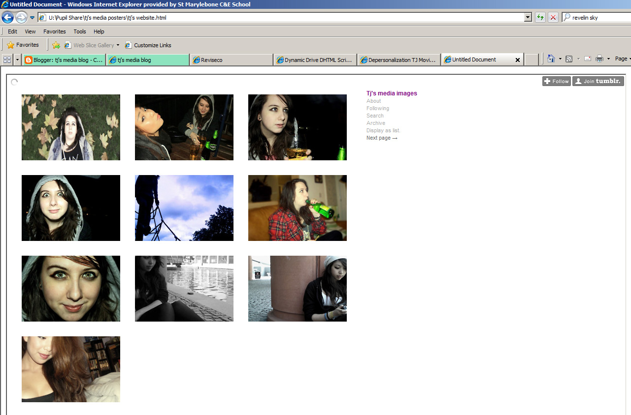
Due to my lack of ICT skills and time I was unable to create my dream website featuring a java script loading page to the website, and GIF’s appearing everywhere. However I did manage to stick to some codes and conventions such as the title of the film, main image from the film, the logo of the uk film council, and the trailer.  I have also created a number of fake links to pages such as synopsis, videos and cast and crew. My gallery page works and links through to the tumblr I have used to store all the photos from my production work. I realise I have left a lot of conventions out such as ratings, facebook links and actors names, but again I did this intentionally so it would leave the audience more intrigued, and I figured it would work in my favour as the audience would then research the film to find out who the actors are and what rating the film has been given, which essentially is publicity for the film. 

Slide 5
For my teaser I have met a number of codes and conventions such as relating to the mind, Depersonalization is actually a mental health symptom so I felt by choosing this name and showing how the symptom is portrayed I am sticking to codes and conventions. Using vulnerable young women I feel is a typical convention of a psychological thriller this is seen in films such as black swan, and abandoned I have also used a green screen film rating image and a coming soon ending clip to fit with the codes and conventions of teaser trailers. I have analysed three clips from youtube that I felt were really beneficial to me. The first being Girl interrupted. This relates back to my point of vulnerable young women, as a girl played by Winona Ryder gets admitted to a mental hospital. I found this clip really useful mainly for it’s opening speech. The second being Thirteen. This I felt helped me tackle the objective of attracting a teenage audience, and tacking the issues with teenagers. I felt the use of shots and editing really beneficial The final being a fanmade skins trailer entitled loneliest girl in the world. I found this trailer really helpful as it really helped me pull together the concept of mental health and teenagers. I felt the shots and emotions inspired me when making me teaser. 

Slide6
I feel that my main product and ancillary texts are really effective as I have maintained the same type of font the whole way through, I have stuck to the codes and conventions of a psychological thriller, use of editing such as photo filters and how I create a ghost like effect on all my posters. 

Slide7
I have learnt from my feedback that not everyone can grasp the idea of mental health. On one of my feedback sheets I received a comment saying my trailer was “weird” I completely accept the criticism, and i was prepared for some stigma as it is a film to do with mental health.  
That through the use of my editing and effects, I have managed create a generic psychological thriller that an audience of teenagers are able to recognise
That I feel I am able to give the audience what they want because of my age, I feel that the younger the director the stronger the message is. I am familiar with the feeling of depersonalization and I have researched it thoroughly, and I felt this really aided me when creating the teaser
That I am able to connect with people who are aware or suffering from some sort of mental health difficulty as I received a comment saying “Your voiceover sounds like a tumblr post” Tumblr is a social networking site that is often viewed as where the alternative kids blog their feelings. So I felt that I was able to connect with my audience.

Slide8
The technologies I have used are
Blogger This site I used to post all my work that I had done over the last year in order for people to see it.
Slideshare I used this site to host my powerpoints as blogger is not able to host powerpoint files
Youtube  I used this site to research psychological thriller teasers, and host my practice teasers.
Logic pro 9  I used this program to edit and manipulate my soundtrack using a range of effects such as reverb Eq and compression
Vimeo I used this site to upload my final teaser, I felt this was more effective than youtube as I was able to edit the size of my video for when I uploaded to my website
Adobe Photoshop I used this program to edit and manipulate the images I had taken during my production. I found this really beneficial as it made my photos look  more professional
Microsoft powerpoint  I used this program to create powerpoints about my work, this saves space on my blogger, rather than writing pages about what I have done, I can write about it in a slideshow and then use slideshare to upload it
Macromedia dreamweaver  despite being the hardest program I have ever used, I managed to use this to create my website using a range of html coding and uploading
Microsoft excel  I used this program to organize my time and project plan
Adobe after effects I used after affects to add any final effects such as photo filtering and colour manipulation to my trailer
Adobe Motion  I used this to create my ending clip that says “depersonalization, coming soon”
And finally Final cut pro, the program i had used to edit my film which wasn’t as difficult as it sounded

Tuesday 19 April 2011

Tuesday 5 April 2011

Bloopers

This is my blooper reel. I decided to make it to lighten the mood of the trailer as it's quite deep and portrays a lot of different emotions. I felt a bit of comedy was needed

Monday 4 April 2011

Printscreens of my official website


This is my official website online. I have embeded my trailer onto the site using a program called Macromedia Dreamweaver. I found using this quite difficult as it involved lots of formatting and html coding. Eventually I got the hang of it after resizing and moving my video around till it was
(<)style type="text/css"(>)

#place{
Position: Absolute;
top: 125px;
left: 500px;
}
(<)/style(>)

this sizing was where I wanted it to be.

Since I had taken a lot of photos during my production I wanted to show them off, so I made a gallery page hotspot link. I had previously uploaded all my images to tjmediaimage.tumblr.com so that I wouldn't have random image posts every now and again on my blog. I linked my gallery page to this site.


Mockup

This is my mock up for a gallery page, I have used photoshop to illustrate how I would like it to be.

1/3 of the page is an image, following the rule of thirds. I will have my title on my right side to follow the eye line rule. When the audience see the website they'll see the title, then the image and then the links.

My website JPEG

This is my final website design. Using one of the images I had taken whilst filming I developed a website. I opened up my image in photoshop and then made it smaller to fit the size of 998 by 560px as this is the size the website needed to be. I then used the courier font, (the font i'd used throughout this production) and wrote the title, cast and crew, gallery, synopsis, videos, and coming soon. I then duplicated these layers and lowered the opacity to create a shadow effect to relate to my genre. I have also included my billing box from my poster, as this is a typical film website convention. I also included logos such as film4, 12A film rating, and the UK Film council. I also included an "all rights reserved" caption. I then coloured my edges in order to abide by the conventions of film websites, I learnt that the edges are meant to fade. I achieved this by using a blurry brush and colouring the sides of the image white.

Monday 28 March 2011

Feedback about teasers

Generally people liked the teasers they watched apart from one comment from someone who thought it was weird, I was prepared for negative comments like this as there is a stigma that is attached to mental health. Comments like "weird" increase stigma when there shouldn't be stigma. Having mental health problems is the same as having a physical problem. I accept the criticism, but i'm not happy with the way it was phrased.

Saturday 19 March 2011

Updated project plan

i am almost up to date with my media work as shown in my project plan, the only outstanding work at this point is my website

first draft of teaser


This is my intro for my media trailer. The opening shot is a long shot of Melissa on a busy street. I've chosen this location because it creates a lot of distraction in the background which creates the illusion that Melissa isn't as important as the background, which makes the character appear quite empty. I have also used manual focus in this shot as I wanted this shot to be blurry. This creates a dissociative atmosphere, a lack of reality. I have used a number of effects to enhance the shot. I've altered the contrast and levels to make the shot appear darker which ties in with the genre of the film. I have also used the colour wheel on final cut pro to add an orange, green and black photo filter. This creates a a natural and glowy effect to the shot, and the black photo filter allows the colour to drain from the shot again relating to my choice of genre.
My second shot is a tracking long/midshot along Marylebone Road. I've delibrately made the camera movement jolty as I feel a steady shot wouldn't be appropriate in a teaser about mental health. I had asked Melissa to appear slightly agitated and jumpy to allow her to connect with her character. I had also asked her not to stare directly at the camera as, I wanted her to appear dissociative and disconnected with the environment around her.
My third shot is a side angle tracking midshot. I used this shot because I wanted to show the audience how Melissa felt, and in this shot she appears very stressed as she pulls her hair away from her face. I also used this shot because the majority of shots I had for the intro were all head on walking/running shots down the road so I felt a different angle was needed. I deliberately chose to face away from the road to make the shot a lot darker, as the only light in this shot is the flood lights shining off of the block of flats.
My fourth shot is a long shot. Again I have used manual focus to make Melissa appear blurry. I told Melissa to walk slowly in this shot as this is when
My fifth shot is a long shot and a zoom out to midshot. I asked Melissa to run towards me and appear distressed. This relates to my chosen genre as the character clearly is quite upset. I used this location because there are several street lamps around this courtyard and I needed quite a lot of lighting in order to show her distress.
My sixth shot is a close up shot of Melissa. I have used this shot to show Melissa's facial expression, which could be argued shows a sense of manipulation and a sudden contrast from upset to feeling dark and dangerous. Before I had filmed this shot, I had already written the speech for Melissa, so I knew the final sentence would be "I am alone" which I felt really needed a dramatic shot, and I felt a closeup showing emotions would be the best shot.
My seventh shot is a blurred shot of glow sticks. I have used this shot because it massively contrasts with the previous shot, I have used it to shock and confuse the audience.
My eighth shot is a panning shot of Niamh looking overly excited, again I used this shot because it is a complete contrast to my previous shots, i've dramatically changed the mood to confuse and draw in the audience. I've also changed the mood because depersonalization, is a symptom of borderline personality disorder and another common feature is mood swings. I feel I have shown the mood swings through my editing skills. This also shows my extensive research into depersonalization.
My nineth shot I've used as a fast cut bridging shot, it doesn't have any significance apart from that it's a linking shot and I've used fast editing to stick to my idea of genre.
My tenth shot is a night shot of Niamh. I have used this shot to again confuse the audience. The night shot signifies how Melissa sees Niamh. Melissa perceives Niamh as an unfamiliar character, almost a threat.
My eleventh shot contradicts my last shot, the thought of Niamh being an unfamiliar character. This shot shows Melissa and Niamh running towards the camera as the camera zooms out.
My twelfth shot is a jolty blurry shot of Melissa, which insinuates that maybe Niamh was never there as she's not in this shot, and the blurred effect gives a mysterious effect
My thirteenth shot is of Niamh prancing around, this could be seen as Niamh taunting Melissa, as if she's a figment of Melissa's imagination.
My fourteenth shot is of Melissa in night mode. I wanted this in my trailer so I could confuse the audience, now the audience will think it's Melissa that isn't real.
My fifteenth shot is of a panning shot of Niamh, I decided to use this shot as a kind of "icebreaker" to break the tension. The change of scenery will again confuse the audience.
My sixteenth shot is a high angle shot of Melissa looking at the camera shocked/scared. This fits in with the music as it builds tension
My seventeenth shot is of Niamh looking at the camera shocked/scared. Again it fits in with the music as it builds tension
My eighteenth shot is an extreme closeup of Melissa's eyes. I have used this shot as I wanted a significant clip when the dubstep beat drops. I feel this works well.
My nineteenth shot is an extreme long shot of Melissa running. I decided to use this shot because it builds up tension after the dubstep drop.
My twentieth shot is a fast cut to a long shot of the previous shot. I had previously researched running scenes and a lot of them feature fast cuts and different angles, so I decided to incorporate this into my teaser.
My twenty first shot is a zoom out (almost vertigo) shot of Melissa running. This is part of my running scene.
My twenty second shot is of Niamh running. I have decided to use this to confuse the audience as the previous shots have all been of Melissa.
My twenty third shot cuts back to Melissa, a shot from behind. This shot gives the illusion that Niamh is chasing her, again confusing the audience.
My twenty fourth shot is of Niamh running, I have used a high angle shot to show her lack of power which again confuses audiences and they then doubt if Niamh is chasing Melissa.
My twenty fifth shot is of Melissa staring at the camera looking confused. Again the audience is confused as the tension suddenly stops and there is calm. It gives the illusion that it was all a dream?
My twenty sixth shot is of Niamh in the shower also looking confused, at this point the audience will be terribly confused, completely and utterly confused.
My twenty seventh shot is of Melissa jumping on her bed, this breaks the tension completely as it's as if she's regressed and everything is "fine"
My twenty eighth shot is my ending titles, a black background with a courier font "Depersonalization, coming soon"
My twenty ninth shot is of Melissa walking and then she slowly fades into Niamh. I used a luma key to create this effect. I have used this shot because it's a perfect cliffhanger for a teaser which will grip the audience intice them and they will want to see the actual film.

Wednesday 16 March 2011

Closing titles


I used the program motion to create my film closing title. Using the courier font I have stuck to the codes and conventions of movie fonts as I have used this during my entire production

2nd Teaser idea


Again like my previous teaser I have decided to go with the voiceover and the soft piano music.

My first shot is of a zoom in of Niamh. This gives the trailer a philosophical edge to it, it makes the audience think.
My second shot is a close up of Mel looking deep in thought, i used this shot because it fits with the speech where it says "what do you see" 
My third shot is a low angle shot of Niamh look really dissociated. I felt this shot really worked as in this shot Niamh appears to be out of touch with reality which basically sums up depersonalization
My fourth shot is of Melissa slowly waking up, her lack of emotion on her face suggests she is out of touch with reality and is dissociating
my fifth shot is of Niamh running next to a canal, I used this clip to confuse the audience as it's such a calm trailer i thought i'd include it in and confuse the audience.
My sixth shot is of Niamh standing in the shower. I felt this shot was very powerful as the background shot is white and the makeup looks a lot stronger with the use of colour contrast
My seventh shot is of Melissa tumbling out of bed. I felt this was really effective as it appears she is having a nightmare and it adds a lot of action to the scene
My eight shot is of Melissa looking confused, I love this shot because of the light against her face, and the confusion on her face works really well.
My nineth shot is of Melissa dancing on her bed. Like the shot of Niamh in the park it shows a lack of touch with reality and a sense of dissociation.
My tenth shot is of Niamh in the bath, again i love the contrasting colours
My eleventh shot is of Melissa looking scared i used this shot because it fits with the type of music and you are able to see her breath in the cold air
My twelfth shot is of Melissa walking I used this shot as a bridge shot to link to the next shot
My thirteenth shot is of Niamh lying down, i used this shot because again it illustrates Niamh's Dissociation

Wednesday 9 March 2011

advertisting my pre posters


I have decided to make "pre posters" for my film. These will be released a month before the release of my main posters. This will intrigue my audience, and it will become a topic of conversation, therefore gaining my film more publicity. I have decided to make it a bus stop advert as people of all ages will see it therefore again gaining more popularity.

I have used one of my photos I had taken previously for this pre poster. This was the original image as you can see I have heavily edited the image on the left. I created two more layers labelled red and blue of the translucent character and used auto levels to create a 3D effect. I then duplicated the text and capitalized it and made it bigger. I then adjusted the colours and contrast to get the colour of the image. I then wanted to distort the image more, so I cut the background image in half and stretched it to create the sense of uncertainty. I feel this is an accurate portrayal of distorted reality.

Monday 7 March 2011

Posters


View more presentations from tjjones2.

My first poster is a landscape image from St Mary's church gardens I have decided to stick to my convention of courier font for the title. I used steel tongs for my billing box. Despite not sticking to many of the conventions of film posters, I felt I have done well as my genre is psychological thriller and by leaving out a lot of the conventions, my poster has remained enigmatic and may entrace the audience.
My second poster is a landscape image of orchardson street. I have decided to use this image as there is a lot of space I could use for text. I have created another layer and lowered the opacity to create a ghost like effect
My third poster is again set is St mary's church gardens. Like the previous image I have created a ghost like presence in the image. I like the use of colours in the image, i created this effect by adding green and black photo filters and increasing the contrast.
My fourth image is my favourite poster, however due to there being very little space in the image I feel I am unable to use it.
My fifth image is the image I am most likely to use. this is my only image of Niamh I have used in my poster. I like the way her character is silhouetted to create an enigmatic feel.

Wednesday 16 February 2011

Changing my background music


I have decided to change my background music because the music I had originally chosen I felt wasn't strong enough. So I downloaded some free music online and remixed it and edited using my music technology skills.

Tuesday 15 February 2011

Editing practice


As the "rave scene" is a vital part of my teaser, I wanted to use a video editing software program to practice editing and fast cutting.

My first shot is a manual out of focus shot, I feel these shots are great to use as they start the footage off with an enigmatic feel. I have made sure that the camera focus's on the glowsticks rather than the actresses.
My second shot is a pan of Niamh and Mel still out of focus. I have kept it out of focus because it sticks to the enigmatic feel. And it asks the question are they really friends? Or is Mel chasing Niamh?
My third shot is a zoom in shot of the wall, I feel this creates tension and the zoom allows a "bridge" to the next shot.
My fourth short is a nightshot of Niamh. I have used a night shot as it is eerie and mysterious

Thursday 27 January 2011

Interim Presentation

This is my interim presentation for my film teaser Depersonalization. I have included a number of clips which i have edited during my filming over the last few months.

Sunday 9 January 2011

An Interview with Niamh Dunphy


I decided that I needed an interview video on my blog to make my film teaser appear real. I researched interviews on youtube and looked at Angelina Jolie's interview for Girl Interrupted which is a similiar film to Depersonalization. I also looked at American chat shows and I started my clip off in a similar way in which they do, I began by introducing the actress and then cutting to a clip of the actress as I spoke over the clip. I then showed a montage of clips based around the actress from my Depersonalization footage.

Wednesday 5 January 2011

Using Final Cut Pro

I have started to use the editing software Final Cut Pro. I have managed to log and render my footage, soundtrack and voice over. I have used a fade in and out on my soundtrack by creating 3 key frames and the beginning and end of the song. This allows me to create a set volume so i can then automate the volume to create a high low and midpoint volume.