Wednesday, 29 September 2010

Moodboard


Create your own video slideshow at animoto.com.

I do not own this song, it belongs to its rightful owners. No copyright infringement intended

Image 1

This picture is of Effy from Skins. I decided to use this image because I feel it represents depersonalization, with its use of levels, colour, makeup and it's element of loneliness. I also like the fact that the image has been taken at night with an interesting lighting backdrop.

Image 2

This picture is of a girl laying on the grass. I like the high levels of contrast in this image. I also like the angle in which the picture has been shot.

Image 3

See Inspiring images slide show

Image 4

I like this image because the caption reads "And suddenly I felt nothing" Which is a common symptom of depersonalization. The woman is also wearing sunglasses which hide her emotions, which i feel is quite a strong element of the image.

Image 5

This image is of a girl sitting on steps. I decided to use this image because of the unique fashion sense. I like her grungy style, and i plan for my characters to wear similar things.

Image 6

This image is a of a boy in the rain. I like this image because it's in black and white and it holds a lot of emotion. I hope to achieve a shot like this by creating a hoswer scene rather than a rain scene.

Image 7

This image is of Courtney Love and Kurt Cobain. I like this image because of the background. I hope to achieve a shot with a strong background.

Image 8

I like this image because it shows a lot of emotion. I also like the fashion sense the girl has. I like the way the girl is sitting, as it represents isolation which i feel relates to depersonalization.

Image 9

I like this image because of the girl's fashion sense and makeup. I also like how the photo has been edited.

Image 10

I like this image because of the setting and fashion. I love the leopard print, denim, and brand "wild fox" as they're quite grungy. The setting appears to be a train station "subway" which is also quite a grungy setting.

Image 11

I like this image because, I hope to shoot something similar to this in my film. It relates to depersonalization as it's like an outer body experience. I can achieve this in my film by using "Luma key" I also like the photo filter used as it creates an eerie feel to the image.

Image 12

I like this image because, although it is a sketch of a rabbit with the caption of "Just because you're paranoid" it depicts a lot of emotion. This image tells me exactly what a paranoid person would look like.

Image 13

See inspiring images slideshow

Image 14

See inspiring images slideshow

Image 15

I like this image because it is literally what depersonalization looks and feels like.

Image 16

I like this image because it portrays a lot of emotion, and I plan to shoot a scene like this. I like the use of photo filters, as they give the image a natural feel.

Image 17

(image 2)

Image 18

See inspiring images slideshow

Image 19

(image 4)

Image 20

Again, this is another image that sums up depersonalization. People who suffer from depersonalization feel that something's missing from their life.

Inspiring Images

Inspiring images
View more presentations from TJ Jones.

First image


"i hate this feeling" this could be a symptom of depression. And the majority of individuals with depersonalization suffer from depression. I plan to make the main character quite depressed. But more detached than depressed. I chose this picture because the individual is a female, like my main character and she's writing using lipstick which is a stereotypical female item.

Second image


This image is of a girl hiding behind a tree. She appears to be quite scared. I have chose this picture mainly because she has pink hair. This makes the picture different and unique, much like people with depersonalization disorder. It also appears that the quality of the photo is either an SLR, or polaroid, or a disposable camera, as the quality is so grainy. This is how i plan to edit my film, using grainy or chroma key effects.

Third image


This image is of a girl in a black t-shirt,  over the knee socks, and a leather jacket. I chose this image because this kind of fashion I plan to use on my character.

Fourth image


This image is of a girl sitting down getting dressed. I chose this image because of the quality of photo. I like the use of grainy effects, this is how i plan to edit my film.

Fifth image

This image is of a girl in a bath, looking like she has drowned. She is wearing heavy makeup to create a stronger artistic effect. I plan to use a similar shot in my film, as it's very artistic and can be seen as quite psychotic. 


Sixth image


This image is of a girl wielding a knife. This fits with the genre i plan to base my film around. She has a malicious smile, which fits again with the genre. This image has made me realize how important emotion is and how close up shots can depict this.

Seventh image


This image is of a girl lying on her bed. The girl isn't the main focus in the image, it's of the colourful background. I plan to shoot in a bedroom similar to this bedroom with colourful images in the background.

Eight image


This image is of a girl standing on a windowsill. I chose this image because of the girl's fashion. I plan to use a similar style for my characters.

Ninth image


This image is of a girl, again I chose this image because of the fashion sense. But the girl's face depicts an emotion similar to how i would portray someone with depersonalization.

Tenth image


This image is of a girl on the floor. I chose this image because it represents depersonalization. I feel this is a really strong image to depict this, and i plan to shoot using the same angle and position of the character.

Eleventh image


This image is of Courtney Love sitting on a bed with a guitar. I chose this image because she represents the "grunge" style. I plan to use a grungy style for my character's fashion sense. I also like how there is writing on the walls and how the room is really messy. This is how i want the room I film in to look like as individuals that suffer from depersonalization are highly unorganized.

twelfth image


This image is of two girls. I decided to use this picture because of the levels of editing used, there are high levels of contrast and levels used, which is what I intend on using in my trailer. The girls are also wearing heavy amounts of makeup. I also quite like their fashion sense, so i may take ideas from this photo to use on my characters.

thirteenth image


This image is of a girl leaning against a window. This is quite a depressing image and the girl looks quite scared. This is the level of emotion I want to use in my trailer. As people with depersonalization are quite scared. I also like the editing in this image.

fourteenth image


This image is of a boy laying on his bed smoking. I like the camera angle in this photo, and i also like the drawing on the walls. I plan to film in a location where there are a number of posters/photos on the wall as that gives the location an interesting backdrop.

fifteenth image


This image is of Effy from skins saying "Hit me just once, I want to feel something" I like this image because of the use of dark colours, which give the image a lot of emotion. It also sounds like a symptom of depersonalization. A lack of emotions or feeling in touch with reality.

sixteenth image


This image is from the film control. I like this image because it's a wide/long shot, which is a different shot to all the other images I have found so far. It also shows a lot of emotion, and is in black and white. I represents loneliness, which is a characteristic of depersonalization.

seventeenth image


This image is of the film poster Schizo. I like this image because it's a poster related to mental health. I like the limited use of colours, and grungy font. I also like the tagline "when the left hand doesn't know what the right hand is doing" this tagline relates to schizophrenia, and I plan to come up with something as equally witty for depersonalization.

eighteenth image


This image is of a girl posing. I like this image because of the background colour of the wallpaper. As i plan to have an interesting background where I shoot, as this could relate to depersonalization and could represent "their world" as if they've designed it themselves. I also like the top she is wearing, and I plan to make sure my characters are wearing suitable fashion which can relate to my target audience. It appears she is wearing heavy eye makeup which represents a lot of emotion, so I plan to use this in my film.

nineteenth image


This image is from the film thirteen. I like this image because of the use of photofilters and fashion. I plan to manipulate the levels in my film to portray what the main character actually sees. People with depersonalization see the world differently to others.

Twentieth image


This image is of a girl lying on the floor. I like this image because there is a caption over the image saying "it's not real, it's not real" the use of repetition shows the importance of this. It's also a symptom of depersonalization, feeling that things aren't real. This image is also in black and white which i feel is the best colour setting for expressing emotion.

Twenty First image


This image is of two factsheets about mental health disorders. The first factsheet is about schizophrenia and the second one is about paranoid schizophrenia. I chose these factfiles because, schizophrenia is more recognized than depersonalization. Depersonalization is a characteristic of schizophrenia so I thought it would be relevant.

Twenty second image


This image is of a girl laying on a bed. I chose this image again because of the interesting background.

Twenty third image


This image of a girl. I chose this image because of her fashion sense. I plan to have my characters dress quite grungy. I also like the fact the image is in black and white.

Twenty fourth image


This image is of a silhouette of a girl sitting on a windowsill. I like this image because you can't see her face, only her shadow. This relates to depersonalization, is she real or is she just a shadow? I plan to create a shot like this in my film, as it sums up depersonalization.

Twenty fifth image


This image is of courtney love. I like this image because it's a close up shot of the character's face which clearly portrays how she is feeling. It also shows her messy hair and makeup, which is also a symptom of depersonalization "poor dress"

Twemty Sixth image


This image is another image from the film control. I like this image because it's cut into two sections which i find portrays emotion really well. I plan to use this in my film.


Possible teaser names and taglines


How often do you question existance and reality?

Sunday, 26 September 2010

My second attempt at making a teaser

My first attempt at making a teaser


I have attempted to make this trailer similar to the Skins Clutch trailer, using fast cuts and manipulation of levels.

Tuesday, 21 September 2010

Inspiration for my teaser

I have decided to focus on skins, thirteen and the tracey fragments because they are all films/tv shows that focus on teenage problems.


I have been browsing youtube to find "psychological thriller" teasers to find inspiration for my teaser. I have also been looking at fan made videos of skins and the film thirteen. The way this has been edited almost creates a schizophrenic feel to it, with the use of fast cuts and high contrast editing. This is what I hope to achieve with my teaser. Because I've decided to base my film around depersonalization disorder, i feel that the use of high contrast and auto levels appeals to me when I make my teaser trailer. 


I like this trailer because the use of music (alice practice - crystal castles) could be an example of what I could use for my trailer. The use of upbeat synths and strong emphasis on percussion is how I plan my music to sound. I like the use of contrast, overlapping images and fast cuts.


I like how this video starts out, with Effy's therapist saying "What are you thinking about" Reverb has been used on the voices to make then echo more than usual which fits really well with the eerie music. I am inspired by Effy's fashion sense and may use it in my trailer. I like how at the end of the trailer, fast cuts have been used to build up tension and drama.


I like this trailer because of its use of music, (Where is my mind - the pixies) which is quite relevant to my topic of choice. The opening shot is of an empty top deck of a bus which I plan to maybe recreate in my own trailer, as it could represent the feelings of the character. The title of the film alone creates an eerie vibe with the use of the words fragments. Although I plan to use fast cuts throughout my teaser, the tracey fragments trailer uses long cuts which get the point across, which i admire. The trailer also uses weird colour efects almost like 3D effects, which i quite like. Either the camera was a budget handheld camera, or they've used a number of photo filters to drain the colour out of the footage. This is what I plan to do as it creates an eerie feel. The main character has her hood up quite a bit in the footage, this creates an element of mystery to her personality which is what I plan to do for my main character. Towards the end of the trailer, the cuts become a lot faster to build up the suspense and drama.


I like the way this trailer opens with its use of static sound effects rather than actual music. The images are in black and white which create an eerie feel. The cuts are quite rapid as well cutting to someone screaming which i feel illustrates the genre of psychological thriller. I like the use of the blur effect of Effy's face. I could use this in my trailer as people who suffer from depersonalization experience visions of high contrast and blurred vision. The use of the words "Sometimes I think I was born backwards, come out my mum the wrong way" Would be an excellent quote for a psychological thriller. I like the typewriter text saying "delusional" and I might use something similar for my film.


In this trailer the use of soothing piano music indicates it could be quite a depressing film, and the use of reverb on the voice creates an eerie feel. The use of high contrast relates to the genre of my choice.


The opening to this trailer is more verbal than visual with its use of text. I like the music (Running up that hill - placebo) It appears that the editor of the trailer has beat matched the song, which is what I plan to do for my trailer. An effect has been used at about 0.16 seconds which looks like the iamges are overlapping each other. I like the use of fast cuts. In this teaser, it is clear that fashion is important as the majority of characetrs are standing up so you are able to see what they are wearing. I hope to base my characters around the fashion of Effy. Again, I like the idea of the characters speaking over the music and video clips, with a touch of reverb.


I like the idea of the characters speaking over the music and video clips, with a touch of reverb. The spoken words do not match the clips, creating a sense of detachment, which again relates to depersonalization.The use of colour effects in the clip, really relate to depersonzliation, with its use of black and white, sepia, high contrast and auto levels. The use of overlapping images and slowed down images again too relate. The use of soothing piano music creates a depressing tone for the video. I like the use of fast cuts towards the end of the clip, which indicate a build up of drama.


I like the use of spoken voice over a black background as it creates an element of mystery. I especially like the choice of song (Nobody's home - avril lavigne) The use of black and white represents the emotion in this clip, the editor has also beat matched which is what I intend to do with my clip. The clip also shows writing and newspaper clippings about depression, which I feel relates to my trailer.


This trailer is a typical trailer to illustrate teenage rebellion, with its use of fast past guitars, fashion, amateur filming and use of drugs. I like the choice of music and the fast cuts. The change in colour throughout the trailer indicates the change of feel and emotion which is what I plan to do with my trailer.

Monday, 20 September 2010

Analysing teasers/trailers: Donnie Darko


From IMDB

Donnie Darko doesn't get along too well with his family, his teachers and his classmates; but he does manage to find a sympathetic friend in Gretchen, who agrees to date him. He has a compassionate psychiatrist, who discovers hypnosis is the means to unlock hidden secrets. His other companion may not be a true ally. Donnie has a friend named Frank - a large bunny which only Donnie can see. When an engine falls off a plane and destroys his bedroom, Donnie is not there. Both the event, and Donnie's escape, seem to have been caused by supernatural events. Donnie's mental illness, if such it is, may never allow him to find out for sure.


The use
 of colours in this image represent the genre clearly. Dark colours such as blue and black are often used in genres such as horror/psychological thrillers.

There is only one image in the poster, which appears to be some sort of demonic rabbit. Photoshop/ editing software has been used to paste into selction characters from the movie.
The colour blue has been used to draw people to the poster. It appears to be a photo filter blue, as it doesn't appear to be a whole colour but a mixture. E.g. a black photo filter has been used to dampen the colour. The image has clearly been manipulated in order to advertise the genre.

Looking at the poster, it's sending a visual message. The fact that a demonic rabbit has been used as the main image does back up that the fact that the movie is a horror/psychological thriller. The use of a white font against a black background does also create an eerie feel. The use of a serif creates the possibility that it could be a horror film, as it's quite a gothic font. The editor has created a shadow efect on the title text to create an eerie feal to the poster. A lack of text telling you about the film creates an element of mystery.

 Judging from the poster, this film is probably for maybe 15+ but definitely 18+. As a demonic rabbit may be quite scarring to early teens.

I feel this is an excellent poster because it is eyecatchingcreates an element of mystery and get's the point and genre across.


The use
 of colours in this image represent the genre clearly. Dark colours such as blue and black are often used in genres such as horror/psychological thrillers.

The image on the poster is the main character Donnie. He is seen clutching a large weapon which creates an eerie feel. The colour blue has been used to draw people to the poster. It appears to be a photo filter blue, as it doesn't appear to be a whole colour but a mixture. E.g. a black photo filter has been used to dampen the colour. The image has clearly been manipulated in order to advertise the genre.

Looking at the poster, it's sending a visual and verbal message. The use of a white font against a black background does also create an eerie feel. The use of a serif creates the possibility that it could be a horror film, as it's quite gothic. The editor has created a shadow efect on the title text to create an eerie feal to the poster. A lack of text telling you about the film creates an element of mystery. The tagline "why are you weaing that stupid man suit" leaves an element of mystery for the viewers as it doesn't explain anything about the film. In the centre of Donnie's body, there appears to be a sun, from which words are coming out. This creates a sort of sci-fi theme. Some of the words coming out of his body are latin, but one of the english words are "interrupting" The fact that some of the words are latin, creates a horror/gothic feel, and the word interrupting could be seen as quite disturbing.

 Judging from the poster, this film is probably for maybe 15+ but definitely 18+. As a the main character is clutching a weapon, which could insinuate that the film is quite violent.

I feel this is an excellent poster because it is interesting with it's sci fi theme and use of latin and disturbing words. It also leaves an element of mystery, which draws the viewers in.


The use
 of colours in this image represent the genre clearly. Dark colours such as blue and black are often used in genres such as horror/psychological thrillers.

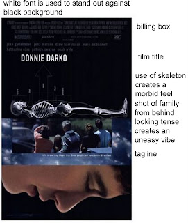
This poster is split into 3 different sections, the first section has the billing box, title and an image of a skeleton. The use of white text on a black background creates an eerie feel. The second section is of a family with a cloud border around the image.the tagline says "Life is one long insane trip. Some people just have better directions" the use of the word insane could indicate that the film is a psychological thriller. The fact that the editor has used such a philosophical quote indicates that it could be quite a deep, psycholigcal and meaningful film. The third section is of the main character, Donnie. The image has been rotated 90 degrees anti clockwise, which makes it look like he is falling. The background is black, creating a sinister feel.

Looking at the poster, it's sending a visual and verbal message. The use of a sans serif font in capital letters creates an eerie modern feel. It also doesn't comply with codes and conventions as there is more than one image on the poster, and there are more than one section to the poster.

 Judging from the poster, this film is probably for maybe 15+ as it doesn't reveal much about the film. But because of the skeleton, use of background colour and font and the tagline, it does hint that it could be a horror/psychological thriller.
 
I quite like this poster because it doesn't follow codes and conventions, i particularly like the use of the philosophical quote.


Wednesday, 15 September 2010

Analysing trailers/teasers: The Signal

The first teaser I decided to analyse was a film called "The Signal" a film directed by David Bruckner and David Bush. 

From IMDB
 
"Imagine every cell phone, radio, and television in your city suddenly broadcasting the same mysterious signal over and over. Now imagine these "terminus" transmissions evoking violent, uncontrollable, psychotic chaos from everyone who comes in contact with them.

The Signal invades the minds of everyday citizens living their workaday lives and having their sordid affairs. Suddenly struck by the power of the insidious transmissions, they are compelled to kill or be killed. Complicating matters is a zombielike resistance some characters have to the idea of remaining dead. The story violently explodes, blending bloody gore with psychological satire, for a truly original horror experience. The Atlanta filmmaking team of David Bruckner, Dan Bush, and Jacob Gentry tell the eerie tale in three parts (cleverly called "transmissions"), shifting perspectives to draw out a larger story that explores dark secrets and fears as well as jealousy and betrayal.

Not for the faint of heart, The Signal will nonetheless satisfy those looking for a smart exploration of the power of media to mutate our minds. It is truly inspired independent filmmaking that will stalk viewers from every dark corner while examining the surprising human madness lying deep within."

IMDB classifies the film as horror/sci-fi/thriller. I decided to analyse this film because I plan to base my film around the genre of psychological thriller. I typed psychological thrillers into google and it came up with this website 


so I decided to watch a few teasers/trailers to see if any related to my ideas.  


The use
 of colours in this image represent the genre clearly. Dark colours such as red and black are often used in genres such as horror/psychological thrillers. The colours used also create quite a negative feel to the poster, in the sense that they're dark and forboding, e.g. the colour red is used to represent the blood trickling down his face.

There is only one image in the poster, which is most likely to be the main character. Photoshop or some sort of editing software has been used to manipulate the eye to again relate to the genre of the film. The colour blue has been used probably to make the eye stand out and to draw people into watching the film as it's quite mysterious. The image has clearly been manipulated in order to advertise the genre. The film is based around the topic of zombies, and so by manipulating the image to make it look like an animated/computerised person, the filmakers have sucessfully edited the image by making the person not look human (relating to the zombie theme) Auto levels, and contrast have been used in the editing process to make the image look quite HD.

Looking at the poster, there are some elements of both a verbal and a visual message. The image obviously gets across that it is a horror/thriller film, and the verbal message "do you have the crazy?" indicates that it could be a psychological thriller. The use of a sans serif font creates a grungy, rough feel to the film. The text has stuck to the colour scheme of red, and black. The red shape behind the text "The signal" makes the the text stand out more. The fact that the text isn't in a straight line and doesn't match up creates a sense of unease and edge to the poster. The tagline looks like something that would be on a ransom letter. Which again ties in with the horror movie genre.  Again a black box has been used behind text to make the text stand out.

Judging from the poster, this film is probably for maybe 15+ but definitely 18+. The use of blood in the poster indicates that the film is quite gory and not for the faint hearted. And because the film is a psychological thriller, it wouldn't be suitable for anyone under the age of 15.

I feel this is an excellent poster because it is eyecatching and uses stereotypes such as blood, dark colours and weird photoshop techniques to illustrate the genre.


The use
 of colours in this image represent the genre clearly. Blue and black photo filters have been used in this image to give it an eerie vibe. The black filter has filtered out the colour of the image leaving it with a blue glow (the blue filter) which relates to the genre of horror/psychological thriller. The colours used also create quite a negative feel to the poster, in the sense that they're dark and forboding.

The image is of the two main characters with a large group of people in the background (which, because of the choice of genre, we assume to be zombies) The image appears to be a relatively close up shot which looks quite HD which shows the emotion of the character's face. The fact that the man apears to have dried blood on his face could represent the genre. The group of people in the background (zombies) make it clear that the genre of the movie is horror/psychological thriller. It also creates a sense of mystery. The actors are also wearing dark clothing which again relates to the genre of the movie.

 Looking at the poster, there are some elements of both a verbal and a visual message. The image obviously gets across that it is a horror/thriller film, a critic has said "this film will explode. Mark my words it has cult classic all over it" The use of the words explode, and cult classic indicate it has an element of drama/horror. The title of the film "The signal" has been edited so it appears that light is coming through it, which in turn reflects off the characters at the front of the image, making them glow amidst the blackness of the poster. The font used for the title is sans serif creating a grungy rough feel to the poster. The colour scheme of the poster is just blacks, greys, whites and a bluey filtered colour. The tagline  "This is not a test" creates a serious element to the poster. It also sounds (when spoken aloud) quite intimidating and scary again relating to the genre.

Judging from the poster, this film is probably for maybe 15+ as it doesn't look too scary, as its created an element of mystery.

I feel this is an excellent poster because of its use of colours, and wording. The use of zombies to indicate what genre of film is also a great attribute.


The use
 of colours in this image represent the genre clearly.
The use of blues, blacks and and orangey colours create an almost post-apocalyptic feel to the poster. The rain effect could be seen as pathetic fallacy as it creates a negative feel.
A sepia tone emphasises this apocalyptic effect, and also creates the image that there is a fire in the background behind the characters. The colours used also create quite a negative feel to the poster, in the sense that they're dark and forboding.

The image is of the two main characters centred in the image, with two male characters either side wielding weapons. Which creates the impression that the poster is advertising a action/horror film.The look of anger in the left and left centre man creates a dramatic feel to the movie and again relates to the genre of music. In the background of the image, the main chracters appear to be getting chased by zombies which again relates to the genre of the movie.

 Looking at the poster, there are some elements of both a verbal and a visual message. The image obviously gets across that it is a horror/thriller film, a critic has said "A bloody blast from start to finish. Refreshingly original" The use of the word bloody indicates it has an element of drama/horror. The title of the film "The signal" has been edited to emphasize the word "signal" The tagline  "This is not a test" creates a serious element to the poster. It also sounds (when spoken aloud) quite intimidating and scary again relating to the genre.

Judging from the poster, this film is probably for maybe 15+ or perhaps an 18+ as the use of weapons on the poster could indicate its a violent or quite gory movie.

I feel this is an excellent poster because of its use of colours creating an apocalyptic feel. The use of zombies to indicate what genre of film is also a great attribute.