
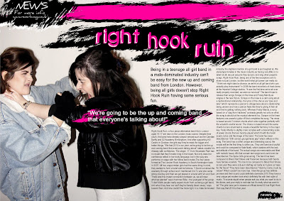
TThis is the final design for my double page spread. I have stuck to the colour scheme of black white and pink which matches my front cover. This avoids confusion for the readers and meets their needs. I feel that using more than three colours creates confusion and complexity. I have chosen bright colours because it will attract my target audience of teenagers. The colours used are eye catching and again appeal to my target audience as they have a small attention span. I have chosen the colour bright pink because my featured band is a girl band and i'm sticking to stereotypes, codes and coventions to appeal to more people. My image is of the drummer and vocalist. I have asked them to pose in this way because it represents anarchy and rebellion. This will appeal to teens as they too will be experiencing a phase of rebellion, it may even influence them to start their own girl band. I had asked my models to wear typical "grungy" clothing. This is seen in the denim and leather jacket. This will appeal to my teenage grunge audience. I have stuck to a number of double page spread conventions. I have used a slug and a caption in the top left hand side of the image. A slug is a short snappy bit of writing at the top corner of a magazine. In this case it's entitled "News" This will tell the reader that this section of the magazine is based on news. As I only have one image i decided to add a caption underneath the slug. My caption says "for more info, www.reverbmag.co.uk" This lets the reader know if they want to find out any further information about the featured band they can do so by going to the magazine's official website. I used the sans serif font "Daniel" for this. This is because the slug/caption isn't as important as the headline of the article and won't interest the readers as much. It would also be illegible if it were in the same font as the article heading (green piloww). As you can see I have removed the by line saying who took the photos and who wrote the article because my target audience won't be interested in finding out this information and I am therefore meeting the needs of my target audience. I have also put in a pull quote reading "we're going to be the up and coming band that everyone's talking about" This arrogant quote tells the reader that they are in fact going to be the up and coming band that everyone will be talking about. It is a very cliched quote but the confidence of the quote may attract media/record label attention to the band, it will also attract a lot of people to go and listen to their music as they are so confident. I have quite a lot of white space in my image, I have edited it this way to avoid the page looking too busy, this caters for my target audience as they have a short attention span and if the page is too busy they won't absorb all of the information. I have added another double page spread convention, a page number at the bottom right hand corner of the page. This will tell readers what page they are on. I have also added the magazine name next to the number. I thought this would look better than just having a number. I have used the same font "green piloww" as the masthead on the front cover. I also have leading text which introduces the article. I have decided to include this because it gives the reader an insight to what they are reading before they decide to read the entire article. It's also in a bigger font so teens will prefer to read this. I have used grungy brushes from photoshop to emphasize that the band are grungy. I have used these as backgrounds for text and my page number to show importance. I have ensured that my heading is bigger than the other text in the image to stick to codes and conventions and to show importance. I feel that I have done this well as it stands out and is eye catching. I had several grammatical errors to correct before I could submit this. The colour where the page folds did not match the background colour so i had to use the blur and smudge tool in order to make it match.

No comments:
Post a Comment