

I have also made the black grunge shape smaller so more of the image is seen.
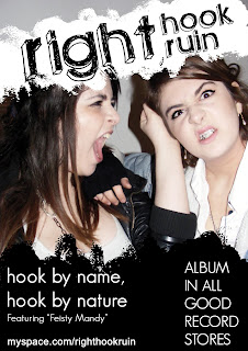
This is a draft of my advert that will be featured in my magazine. I have decided to stick with my featured band, Right Hook Ruin as I had a number of photos I could choose from. Like my front cover, and double page spread I have used the same grunge shape as a background for the text and the font, "green piloww" is also the same. I have decided to keep it simple to get the point across clearer. I have used black and white which are the same colours i used for my magazine. The album title "hook by name, hook by nature" is how a music industry professional had described the band. The album name is in lower case to show the informality of the teenage band. In smaller text I have written "featuring Feisty Mandy" this is a single the band have released. If people like the single and see the advert for the album, they may wish to purchase the album which in turn creates publicity for the band. I have also added the band's myspace at the bottom of the page. This will tell people where to check out the band for more information. People who don't buy the CD may still check out the website, again creating publicity for the band. I have added in a larger font "ALBUM IN ALL GOOD RECORD STORES" to let people know that the album is easily available.
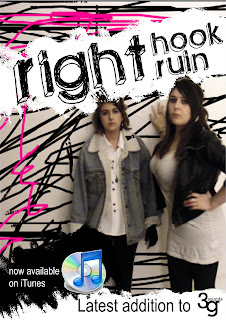 This is the first advert I designed. I decided to stick to using my featured band as I had taken a number of photos of them so i had a variety to choose from. I have stuck to the colour scheme of my magazine by using pink and black scribbles to make the image stand out better. I have also used the same font and grungy shapes to meet the needs of my target audience. I have added the iTunes logo to make the advert seem official, and if people see that the music is on iTunes they are more likely to take the band seriously and check them out. This creates publicity for the band. However the background image is blurry and the advert seems too crowded so i have decided not to use this as my advert.
This is my mockup of my advert. I have decided to use one main image, probably of right hook ruin as i have quite a few photos I can choose from. I will stick to using the grungy shapes and colour scheme to appeal to my target audience.

No comments:
Post a Comment