Saturday, 27 March 2010
Issuu
These are my music magazines. I have two magazines because I have made 2 TOCs and I liked both of them so i decided to submit both. I feel they both have certain qualities which will allow me to achieve a high mark, but I wasn't able to combine them as some of these qualities clashed.
Friday, 26 March 2010
Updated project plan
This is my updated project plan. I have used my time management skills to stay on track. I am currently working on my evaluation, and by looking at the project plan this shows i am on track. I decided to create a project plan so that I could organise myself and the work I was doing. If I set myself a date to do something by, and i had it written down, I would stick to it, rather than someone telling me, and then me forgetting. I had my project plan printed out and stuck on my wall to remind me when things had to be in. This has helped me stay on track in these past few months. I plan to create plans for my other subjects in order to stay on task.
Monday, 22 March 2010
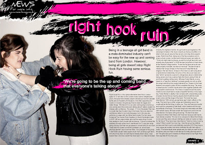
Final DPS

TThis is the final design for my double page spread. I have stuck to the colour scheme of black white and pink which matches my front cover. This avoids confusion for the readers and meets their needs. I feel that using more than three colours creates confusion and complexity. I have chosen bright colours because it will attract my target audience of teenagers. The colours used are eye catching and again appeal to my target audience as they have a small attention span. I have chosen the colour bright pink because my featured band is a girl band and i'm sticking to stereotypes, codes and coventions to appeal to more people. My image is of the drummer and vocalist. I have asked them to pose in this way because it represents anarchy and rebellion. This will appeal to teens as they too will be experiencing a phase of rebellion, it may even influence them to start their own girl band. I had asked my models to wear typical "grungy" clothing. This is seen in the denim and leather jacket. This will appeal to my teenage grunge audience. I have stuck to a number of double page spread conventions. I have used a slug and a caption in the top left hand side of the image. A slug is a short snappy bit of writing at the top corner of a magazine. In this case it's entitled "News" This will tell the reader that this section of the magazine is based on news. As I only have one image i decided to add a caption underneath the slug. My caption says "for more info, www.reverbmag.co.uk" This lets the reader know if they want to find out any further information about the featured band they can do so by going to the magazine's official website. I used the sans serif font "Daniel" for this. This is because the slug/caption isn't as important as the headline of the article and won't interest the readers as much. It would also be illegible if it were in the same font as the article heading (green piloww). As you can see I have removed the by line saying who took the photos and who wrote the article because my target audience won't be interested in finding out this information and I am therefore meeting the needs of my target audience. I have also put in a pull quote reading "we're going to be the up and coming band that everyone's talking about" This arrogant quote tells the reader that they are in fact going to be the up and coming band that everyone will be talking about. It is a very cliched quote but the confidence of the quote may attract media/record label attention to the band, it will also attract a lot of people to go and listen to their music as they are so confident. I have quite a lot of white space in my image, I have edited it this way to avoid the page looking too busy, this caters for my target audience as they have a short attention span and if the page is too busy they won't absorb all of the information. I have added another double page spread convention, a page number at the bottom right hand corner of the page. This will tell readers what page they are on. I have also added the magazine name next to the number. I thought this would look better than just having a number. I have used the same font "green piloww" as the masthead on the front cover. I also have leading text which introduces the article. I have decided to include this because it gives the reader an insight to what they are reading before they decide to read the entire article. It's also in a bigger font so teens will prefer to read this. I have used grungy brushes from photoshop to emphasize that the band are grungy. I have used these as backgrounds for text and my page number to show importance. I have ensured that my heading is bigger than the other text in the image to stick to codes and conventions and to show importance. I feel that I have done this well as it stands out and is eye catching. I had several grammatical errors to correct before I could submit this. The colour where the page folds did not match the background colour so i had to use the blur and smudge tool in order to make it match.
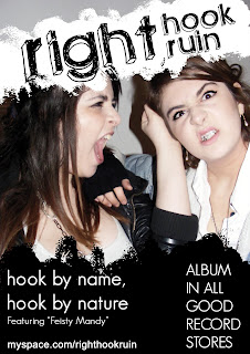
Draft and final advert
This is my final advert. I have made a few changes such as adding colour to "right hook ruin" I added colour because I realised my target audience are attracted to bright colours, so if i were to add a bright colour to the advert I would attract more people.If I had left it without colour, the image would have been plain and dull. So I felt if I added colour I would meet the needs of my target audience. I have stuck to my colour scheme of black white and pink to avoid confusion and the complexity. I have bolded the album name "hook by name, hook by nature" to emphasize it's importance. I have also changed the text on the right side of the image to "DEBUT ALBUM OUT NOW IN ALL GOOD RECORD STORES" I have changed it because it wasn't informative enough. Now people know that the band have released their debut album.
I have also made the black grunge shape smaller so more of the image is seen.

This is a draft of my advert that will be featured in my magazine. I have decided to stick with my featured band, Right Hook Ruin as I had a number of photos I could choose from. Like my front cover, and double page spread I have used the same grunge shape as a background for the text and the font, "green piloww" is also the same. I have decided to keep it simple to get the point across clearer. I have used black and white which are the same colours i used for my magazine. The album title "hook by name, hook by nature" is how a music industry professional had described the band. The album name is in lower case to show the informality of the teenage band. In smaller text I have written "featuring Feisty Mandy" this is a single the band have released. If people like the single and see the advert for the album, they may wish to purchase the album which in turn creates publicity for the band. I have also added the band's myspace at the bottom of the page. This will tell people where to check out the band for more information. People who don't buy the CD may still check out the website, again creating publicity for the band. I have added in a larger font "ALBUM IN ALL GOOD RECORD STORES" to let people know that the album is easily available.
I have also made the black grunge shape smaller so more of the image is seen.

This is a draft of my advert that will be featured in my magazine. I have decided to stick with my featured band, Right Hook Ruin as I had a number of photos I could choose from. Like my front cover, and double page spread I have used the same grunge shape as a background for the text and the font, "green piloww" is also the same. I have decided to keep it simple to get the point across clearer. I have used black and white which are the same colours i used for my magazine. The album title "hook by name, hook by nature" is how a music industry professional had described the band. The album name is in lower case to show the informality of the teenage band. In smaller text I have written "featuring Feisty Mandy" this is a single the band have released. If people like the single and see the advert for the album, they may wish to purchase the album which in turn creates publicity for the band. I have also added the band's myspace at the bottom of the page. This will tell people where to check out the band for more information. People who don't buy the CD may still check out the website, again creating publicity for the band. I have added in a larger font "ALBUM IN ALL GOOD RECORD STORES" to let people know that the album is easily available.
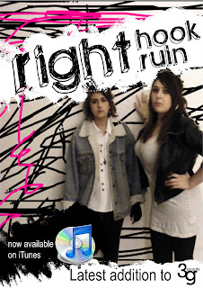
 This is the first advert I designed. I decided to stick to using my featured band as I had taken a number of photos of them so i had a variety to choose from. I have stuck to the colour scheme of my magazine by using pink and black scribbles to make the image stand out better. I have also used the same font and grungy shapes to meet the needs of my target audience. I have added the iTunes logo to make the advert seem official, and if people see that the music is on iTunes they are more likely to take the band seriously and check them out. This creates publicity for the band. However the background image is blurry and the advert seems too crowded so i have decided not to use this as my advert.
This is my mockup of my advert. I have decided to use one main image, probably of right hook ruin as i have quite a few photos I can choose from. I will stick to using the grungy shapes and colour scheme to appeal to my target audience.
Subscribe to:
Comments (Atom)


